Ruskin's revision to the Rudimentary series (1878)
Unpublished manuscript catalogue for proposed re-organisation of the Rudimentary series.

-
 1.
1.
Inscription over the door of Badia, Fiesole. A fitting introduction to our work under the Laws of Fiesole. I am not sure of its date but presume by the rudeness of the birds introduced on the right hand that it can scarcely be later than the xth century. I am sorry that this is drawn all obliquely and imperfectly: in which respect, however, it is a true type of the best I have been able to do in all things. But if I had begun ruling lines I should have been continually impeded in copying the letters by the necessity of their coming into a certain place; whereas now, I think, each is very nearly a fac-simile of the real one; and in this respect also the drawing represents all my work - that in essential points it is useful and in its failures frank. The inscription records the principal laws of Heaven enforced by the early church of Florence. Whatsoever things praying ye seek, believe that ye shall have them and they shall come forth to you. When ye stand to pray, remit if ye have anything against any one.
R.
-
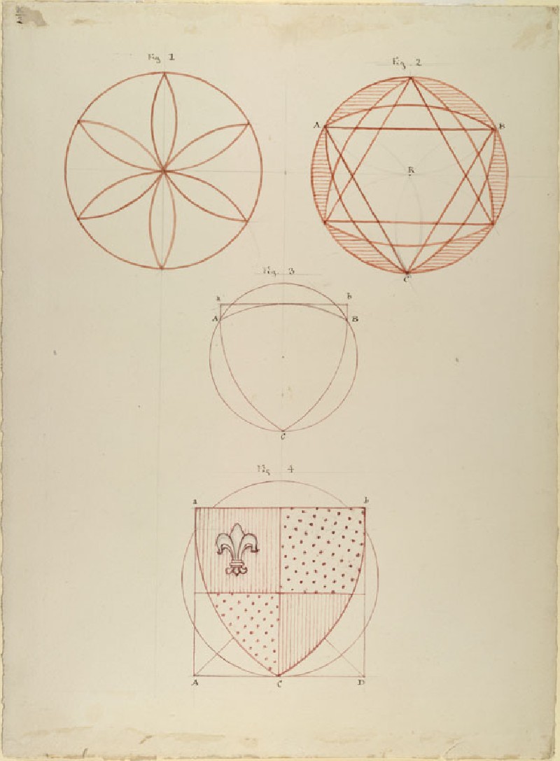
 2.
2.
Geometrical construction of the English shield. My own brush-work. See Laws of Fiesole.
-
 3.
3.
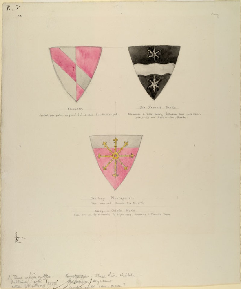
The bearings of Chaucer, Sir Francis Drake and Geoffrey Plantagenet. First exercise in colour.
- 4. R.
- 5. R.
- 6. R.
- 7. R.
- 8. R.
-
 27.
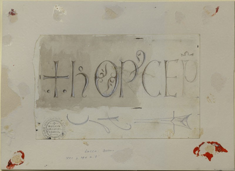
9.
27.
9.
Italian engraved writing of the Lombardic School:- HOC OPUS CEPIT. Exquisitely beautiful in line, characteristic, in manner and in purpose, of the beginnings of work in all the great schools in Italy: - the cross first (compare inscription in No 1.), two little dots put underneath it to mark that it is a symbol not a letter; then the writing begins with perfect ornamental purpose and some delight in enigmatic expression, teaching a lesson, deeper than any writing, of all beautiful things in the Universe that they are beautiful, first, and have meaning, if we will take pains, but on no other condition. As an example of chiselling in fine marble with fine tools and fine hands. I know nothing more exquisite. I permit myself to use the word which I dread most of all dissyllables, freedom, to express what is nevertheless a fact, that the lines are struck on the stone with as much serenity of ease as a great writer would have shown on parchment, and their beauty depends upon insistence on this quality. The P in OPUS for instance, is supremely R. lovely just because the line of it is that of a sail blown out by a breeze from the mast, the sheet at the bottom becoming indivisible; but this is the humour of the artist only in this particular P; for, though I have only sketched it lightly, you see the P in CEPIT is finished in an orthodox manner. Again, while all the upright lines are superbly upright, the little O in HOC is thrown oblique, partly, I believe, lest it should insolently repeat the symmetry of the circles under the cross, and partly to show that the writer was not bound to the upright unless he liked. I hope I have not by any chance omitted the C, but I think my drawing was too careful, and that on the original stone the C was left to the imagination. The exquisite sharpness of the little flourished furrows in the interior of the O is interesting, not only as lovely hand-work, but as showing the intense hardness of the Lucca marble. It is the native stone of the mountain in which Ugolino dreamed of hunting per che i Pisan veder Lucca non ponno.Inf: xxxiii.30 The slightest possible aluminous element and, I think, a little silica is mixed in its crystalline structure, so that it can be carved like marble, R. but has the edges of steel flint and the durability of steel.Note also in this O that it is not divided in the centre of its vertical, but so as to make the higher division smaller, and therefore different in curvature. There is nearly the same difference in the E, and it is made greater, in proportion, in the sign of the contraction above the P; else it would have escaped observation. These edges have remained up to this perfection exposed to external air since the xiith century - I say to external air, and not to weather, because they are sheltered by a far projecting portico from the actual dash of rain. Every student is to copy them, and to receive what may be so received of the spirit in which this work began to be done for guidance of his own future work in life - the work to be done in the particular instance being the Duomo of Lucca, on one of the foundation stones of which this inscription is written, giving us the date for that foundation of
R.
-
 10.
10.
Photograph of the xith century inscription on the first church built in Venice in A.D. 421, the inscription having been put upon it by the Doge Domenico Selvo when he decorated it within and without, about the year 1090. I discovered the inscription myself in Venice when I went back there at the order of Prince Leopold to bring out a new edition of The Stones of Venice. The lettering is much more rigid than that of the last inscription, but that last inscription is the most beautiful I ever saw, and this has still many fine qualities of a similar kind. I need not comment on the principality here of the incipient cross, but it may be a finally convincing lesson to the student of the determination of good artists to secure variety in the dimensions of symmetrical forms to see that the cross, which is the centre of the whole inscription standing for the X in CRUX and for the Chi in CHRISTE, is engraved with unequal limbs. Note, also, the obliquity of the right hand limb in the V of SALUS & of JUS. The terminal limb of the ‘R’s in VERA, 'CIRCA , and MERCANTIBUS present varieties of the pointed R. Furrow used in the O of the former inscription. Compare also the two dashes put for the U and S in MERCANTIBUS.
-
11.
Copy of one of the pages of the Missal of Yolande of Navarre, with an example of minute flower drawing beneath it, in order to show the difference between illumination and painting. It is a mistake of modern times to put finished work, like that of the lower example for an ornament to writing; the resulting effect being only to make the page look as if it were covered with botanical litter. The lower drawing is very lovely and exemplary as an exercise for a student of painting, but entirely useless for an illuminator. I give the copy of the page of the missal before I give the page itself, first, to show, approximately, what the effect of that page was when first done and, secondly, to show how much easier it is to imitate the drawings than the writing of fine illumination. The two preceding examples of writing in stone, and the comparison of this with the following one of writing on vellum, will, I hope, make the student finally understand what is truly meant by the word ‘scripture’.
R.
-
12.
* [Temporarily placed here in substitution for the other leaf of the Missal from which the former example was copied, this latter not having been yet found.][ Leaf of the Missal of Yolande from which the preceding example was copied. ] The book which is in my possession contains 270 leaves illuminated in this manner and was quite one of the most precious examples existing of xiv century M.S. until virtually destroyed by being for two days under water in the cellar of its former possessor M.r Jarman who, when he left his home, placed his M.S. collection in that receptacle for security against fire and had them destroyed by the breaking in of the Thames in one of its great floods about 20 years ago. One only volume escaped, being clasped so firmly that the water could not enter; from which volume I give three leaves our next example.
-
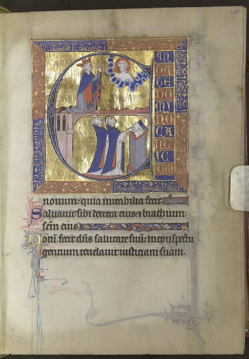
Psalter of
St. Louis
13.
Entirely magnificent xiiithXIII Century work by French masters and in perfect state. Of course the genius varies in great schools as it does in little ones, and most sy M.S.S. show more genius in colour. None of the colour here is, properly speaking, fine, but it is entirely fine in the method and principle, that is to say, in the way it is laid on, and in the laws R. of interchange and gradation as far as they can be taught. No M.S. in the world of its date surpasses it in execution, and as M.S. it is a model of what is at once proper and beautiful. The text is the first thing thought of; the important clauses of this are indicated by beautiful letters, and the necessary pauses in this filled up by fanciful ornament. The grotesqueness and monstrosity of the animal forms are partly praiseworthy, and partly work of the devil, and it is altogether the devil’s work that one does not know how far the evil extends. One thing is certain, that such ornament can only be drawn out of redundant fancy, and if any students like to qualify themselves to imitate it, they must strictly follow its methods of colour and outline, while I wish them to introduce beautiful drawings of real animals instead of these monstrous forms. What else I have to say will be found in The Laws of Fiesole. These leaves are placed here as standards and no student should be allowed to waste time in unavailing efforts to copy them. Among the succeeding examples will be found progressive exercises for copying. [I said in describR. ing No.12 that the book from which the leaves are taken had escaped the destruction of the rest. The brown stain at the edge of the leaves shows to what point the water reached them.
-